Feeling Great 2.0
Home Screen Glow Up Project
Project Context
Role: Product Designer | Timeline: 10 hours
Opportunity: The Feeling Great home screen currently stands out in the overall customer experience, but not in the way as intended. The mountain/valley background is a carry over from a previous design aesthetic, the conflicting primary buttons give users pause as to where to start their Feeling Great experience. We’d like to give the home screen a visual design “glow up” to make it more visually appealing and modern, as well as point the user to a preferred action to get them started.
Constraints: At this time we are not ready to invest more engineering time into the visual look/feel of the overall app. Our plan is to invest in that effort along side our product vision and brand maturing/evolution work to take place over the next 2-3 months. We simply want to temporarily improve the aesthetics of our home screen. This means that fonts should remain the same, the overall user experience should remain the same. The functionality of the Courses section at the bottom should be maintained. Our hope is that these constraints will make this a easy to explore and ideate project.
Goal: End up with a homescreen we are proud of
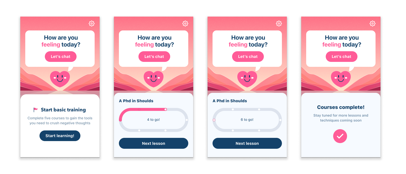
Existing App Experience of the home screen in various states.
Process

Research and Discovery

Transcribing Raw Data into FigJam to sort and find patterns and themes
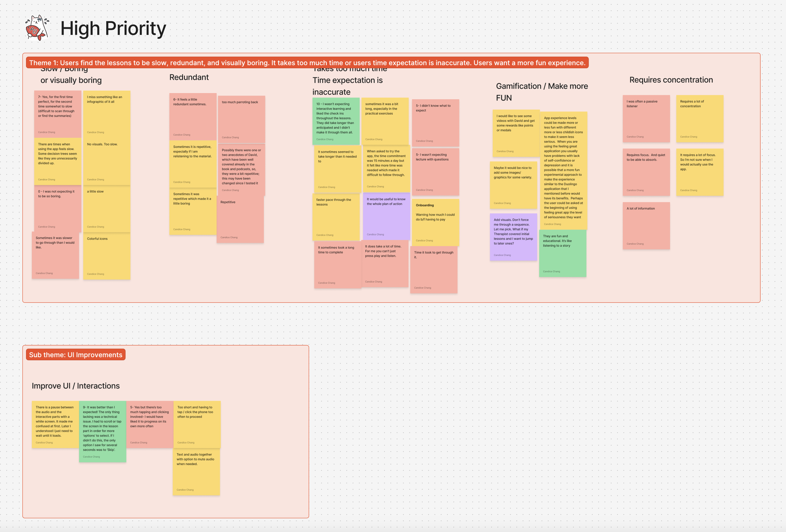


Visual Design Problems:
Existing Experience Problem Diagnosis:
❌ AI Chat function competes with Lessons
❌ Three buttons on the page, two primary buttons compete for attention
❌ Organization is confusing. Track imagery takes up a lot of space
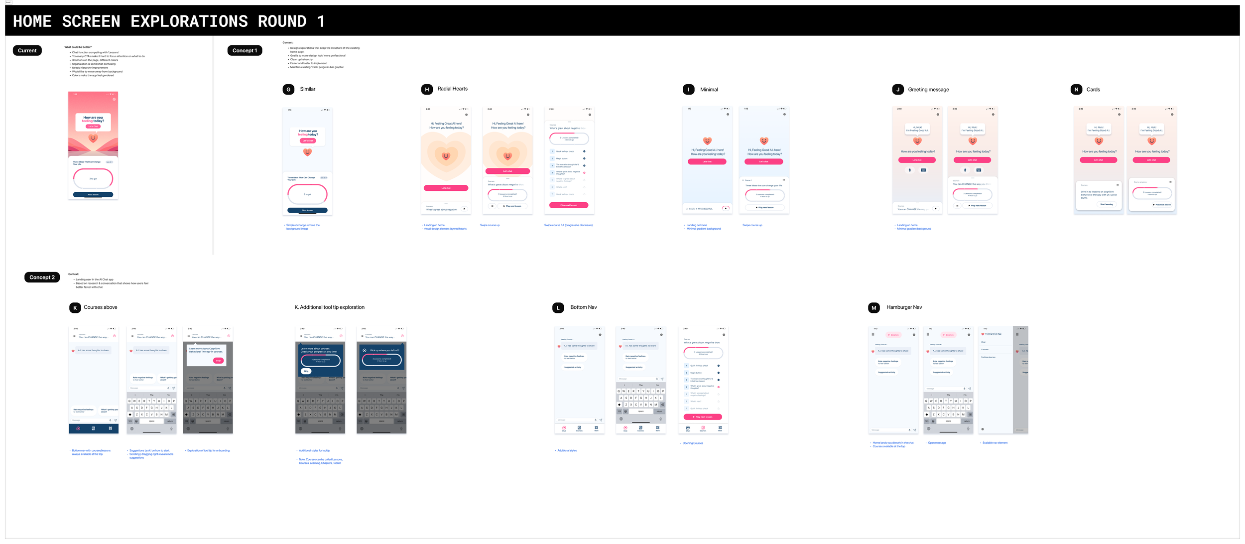
Ideas:
💡Introduce a more clear navigation, clarify the hierarchy
💡Make chat the primary action
💡Minimize the ‘learn’ experience
💡Create opportunities for the AI to introduce relevant content in the ‘learn’ experience.
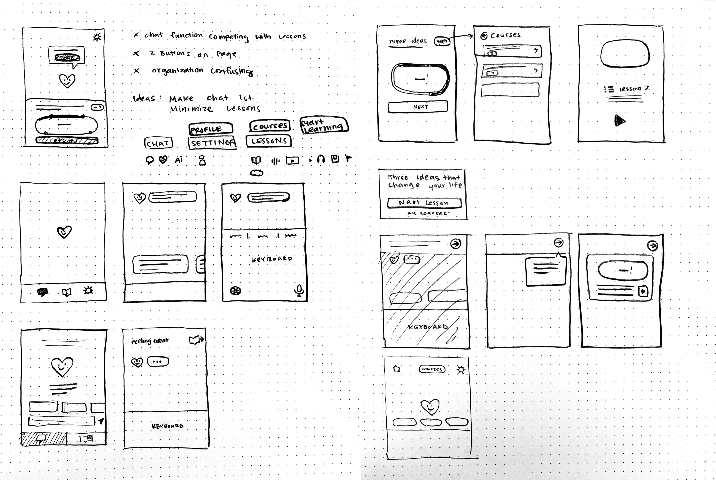
Simple sketches of potential ideas and flows
View this board in Figma

Figure 1.1 Concept 1.H

Figure 1.2 Concept 1.I, 1.J, 1.N
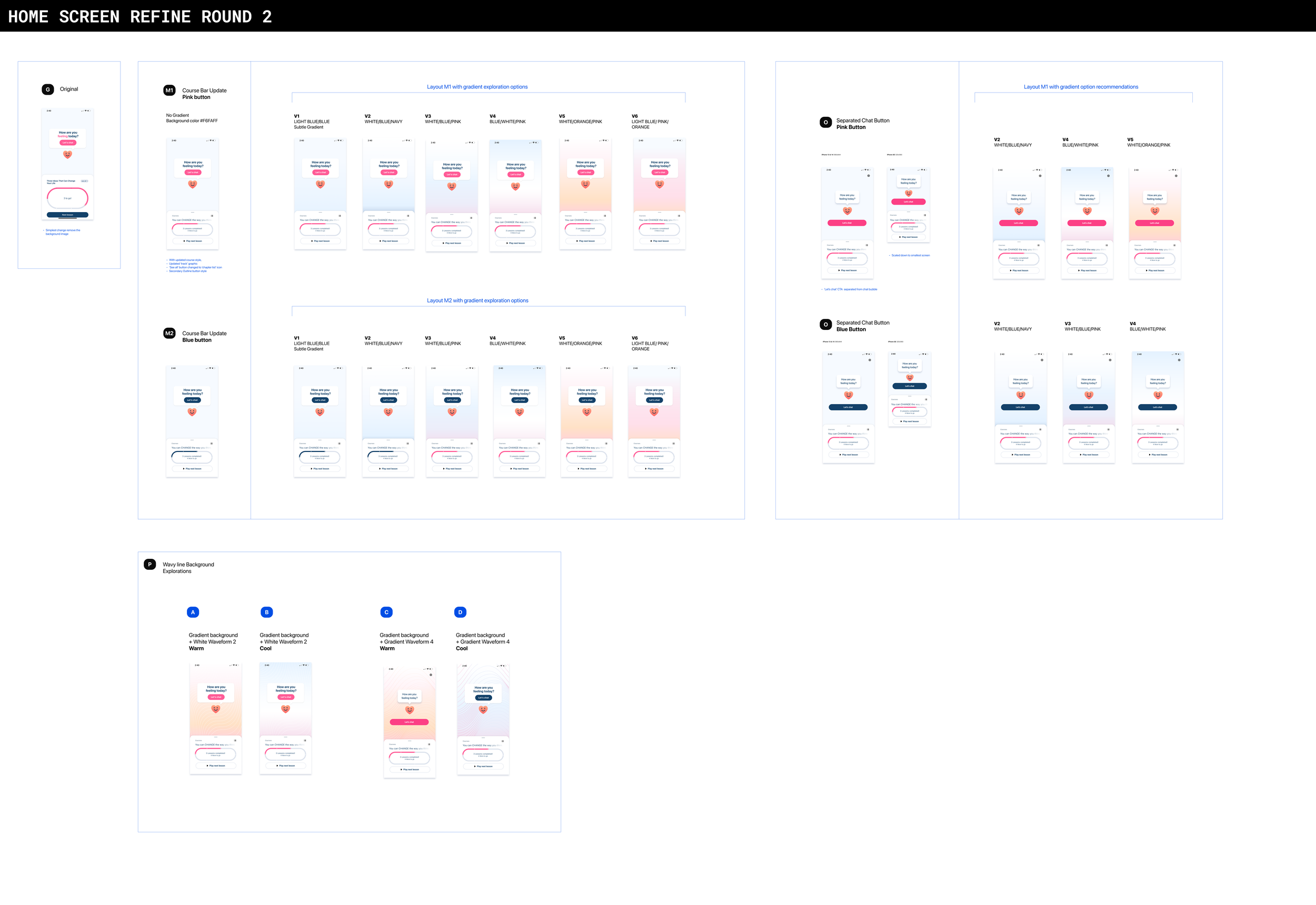
Further refinement, an exploration of color ways. View this board in Figma
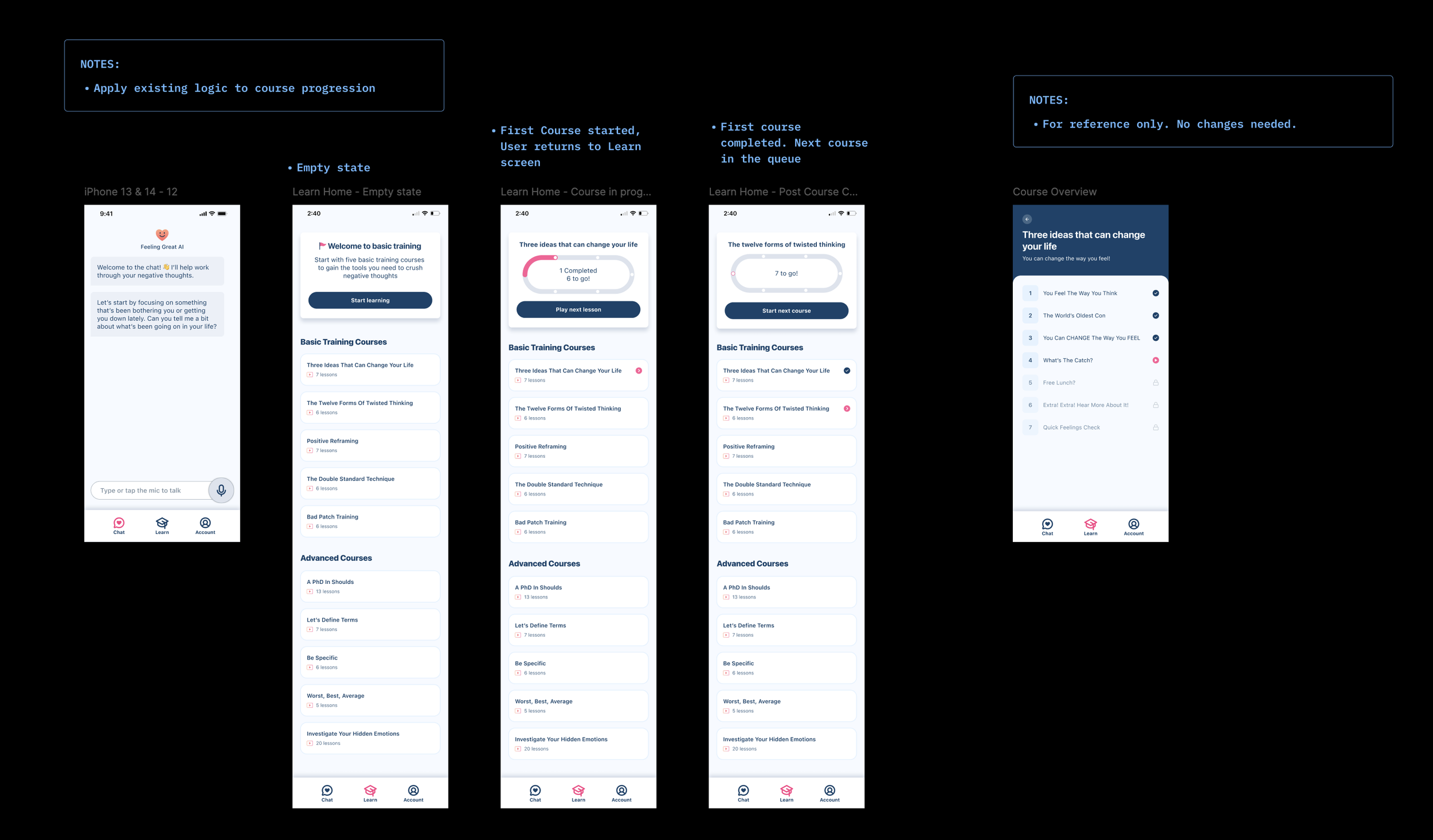
Shipping and Execution
Milestone 1
Decision: The expectation was that Feeling Great would want to update the overall navigation architecture to include the bottom nav exploration. We decided to split development into two milestones. The first milestone was to simplify the home page then fast follow with Milestone 2 so that the user would land in the AI Chat and see a bottom navigation into the learn experience. Here’s the spec sheet I created to communicate Design specs to execute on Milestone 1.